Video is a fantastic way to augment class lectures and let students see examples of habitats, organisms, and various physical/chemical/biological phenomena. Instead of just listening to a lecture about mangrove forests, students can go on a virtual field trip by watching a video. Quite a few educators are now using videos routinely to illustrate scientific concepts. The number of videos suitable to accompany science lectures is growing (here is a great list of videos for teaching ecology). Many of these are produced by professional filmmakers, but some are created by science practitioners and students.
Ecologists who work in different types of ecosystems and study various processes can make an important contribution to science education by making short documentaries (three to five minutes) focused on a particular topic. You may be doing research in an alpine forest, a grassland, or a coral reef. Or, you may teach a field course in a tropical rainforest or a desert. By shooting some footage and putting it together with a brief explanation, you can provide a unique insight into that ecosystem. If you get into the habit of creating short videos during such excursions, you will eventually build up a library of footage to augment class lectures. Students who take field courses or who are conducting field research can also produce informative videos in which they share their experiences and insights with other students or the general public.
I recently visited a unique ecosystem in southern Japan and decided to make a short video about it. I spent about two hours at the site shooting footage with my iPhone (attached to a monopod). I would have spent that much time anyway taking photos and just exploring the site. I additionally spent about five hours over the subsequent three days editing the clips (with iMovie) and incorporating information from the literature. Whenever I had a few minutes during my travels (waiting for a plane or bus), I trimmed the footage or searched the internet for information to include in the video. I did most of the initial editing on my iPhone, but finished the video on my computer using the desktop version of iMovie.
The resultant 4.5-minute video would be suitable to show in a lecture about climate controls on plant distributions or a more specialized lecture about mangrove ecosystems.
Now, some of you may be hesitant to make such a video, thinking that it will take a lot of time or will never be as good as professional science documentaries. Well, your videos don’t have to be of BBC quality to be effective. Also, you don’t need fancy equipment or a film studio to produce an informative and high-quality video. I used an iPhone 6 to film this video, which was rendered in high definition (1080p). As I’ve mentioned in previous posts, the iPhone is easy to use to capture video, especially if you know a few basics. Movie-editing is also quite easy with applications such as iMovie. Video-sharing sites allow creators to easily upload their videos online where they are readily shared with others.
The main point here is that with a little effort, I was able to create a mini-documentary about a topic of interest to students and researchers studying mangrove forests. Students may read about the distributional limits of mangroves, but text descriptions are dry and often not very interesting. A video, on the other hand, takes the viewer across oceans to a remote site they will likely never have the opportunity to visit and creates a memorable example of mangroves growing near their northernmost limit. The video is also understandable by non-specialists who might travel to southern Japan and want more information about unique coastal vegetation found there.
Imagine you are a scientist who has been asked to describe your research at a press conference to a gathering of journalists and the lay public. You are expected to explain not only what your research is about but why it is important and why the public should care about your findings. The press conference organizers are expecting you to present information that resonates with a lay audience. The idea is to minimize any use of data and tell a story that conveys the relevance of your work to society or perhaps what motivated you to conduct the research. And….you have only three minutes to get your message across.
The question is: Can you unlearn years of scientific training and be a more engaging communicator?
That was the challenge facing me and other participants at a science communication “boot camp” held at the Alan Alda Center for Communicating Science. These boot camps are week-long events in which science professionals participate in various exercises designed to improve communication skills. During that week, we participated in improv exercises, a realistic TV interview, and preparation of the three-minute talk described above (view the full agenda here). The latter two exercises were critiqued and also filmed so that participants could later review their performances.
Our three-minute talks were developed during a series of exercises in which we gradually built and then honed our stories into (hopefully) effective and memorable talks. For some of us more accustomed to giving technical talks to colleagues, this exercise was difficult. We were pushed way outside our comfort zones. I was impressed, however, with how well all the speakers incorporated what they had learned during the workshop to produce creative and interesting presentations.
I decided to take the recording of my press-conference presentation and, with a bit of editing, produce a brief video for distribution on one of my websites devoted to the topic of wetlands—my area of interest. I used iMovie to trim the footage, to create cutaways (to photos illustrating some of the things I mentioned in the talk), to add text titles, and to change up the perspective a bit to make the video more visually interesting. If you are interested in learning more about movie-editing, check out my Tutorials.
The press conference was, of course, imaginary. Our audience was composed of workshop participants and organizers who played the role of journalists and who asked questions about what we presented. As you will see, I went a few seconds over my three-minute limit, but managed to get across my message:
What everyone discovered in this exercise is that it is difficult to “wing it” when trying to deliver a scientific message to an audience completely unfamiliar with the topic. What works for an audience of your peers will not work for a lay audience—or even an audience of scientists trained in other disciplines.
To be successful requires (1) an ability to distill your message so that it is clear and concise, (2) an understanding of what your audience needs in the way of information and emotional connection to the topic, and (3) some skill at storytelling. Giving professional talks at conferences to your colleagues will not really prepare you. A week-long course focused on science communication won’t do it either—although you learn a few things and get some preliminary experience. Like any skill, it takes practice to become comfortable explaining your work to the average person on the street.
Most science students receive little or no training in communication techniques and mainly learn how to talk to technical audiences. That is how I was trained. However, scientists are increasingly asked to speak to the media, to policy-makers, and to the general public about their research. Not everyone is cut out to be a science communicator, of course, but we can certainly improve our communication skills so that we can interact more effectively with lay audiences when the need arises.
Academic institutions are recognizing the importance of science communication skills and are developing curricula to meet this growing need (e.g., Communication across the Curriculum, Louisiana State University). Several science societies are also offering workshops at annual meetings that focus on improving communication skills by members (e.g., AGU). Some institutions have special centers, like the Alan Alda Center for Communicating Science, which offer intensive summer courses or workshops for anyone interested in acquiring new communication skills.
If you have the opportunity to take a science communication workshop or course, you should consider it, especially if you are a student or early-career scientist. Acquiring these skills early will benefit your career in the long-run. Also, you might discover that learning to distill your message, to consider your audience’s needs, and to use storytelling techniques can have beneficial feedback effects on your scientific writing and presenting.
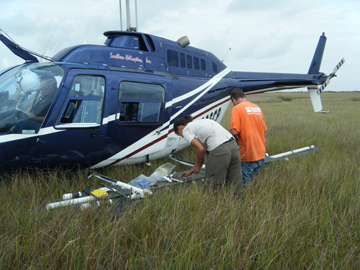
Many researchers, especially those of us who conduct fieldwork, have thousands of photos taken during the course of studies we have conducted—of field sites, equipment, procedures, study organisms, and people. Take the photo at left, for example. I took it during a helicopter survey of marsh sedimentation following the 2011 flood of the Mississippi River. The data we collected were ultimately reported in a couple of journal articles, here and here, but most of the photos remain unpublished.
Photos like this, however, are useful in documenting the conditions encountered during field trips, the procedures employed to collect samples, experimental setups, laboratory protocols, as well as many other aspects of the research. In this study, I additionally photographed each sample site from the air and on the ground, generating a visual record of the vegetation and landscape features.
Scientists most often use such research photos in presentations given at conferences or seminars and, to a lesser extent, in journal articles and book chapters. Some of us also share random images through social media (Twitter, Facebook, Instagram). In most cases, though, these photos simply sit in our files and never see the light of day. This is unfortunate, however, because such images represent important and potentially useful information.
How can we put our research images to better use?
There are many possibilities, but I’ll focus on two options in this post, which is to use photos to craft (1) a visual abstract that summarizes a journal article and (2) a narrative that delves into those aspects of research that are not typically described in a paper (the challenges you faced during the study, the importance of your work to society). In both cases, the researcher is able to visually amplify their work and share it with others.
Create a Visual Abstract
One way to use research photos is to augment a journal article with a visual abstract, which is a summary that uses images instead of text to briefly describe the findings of a study. Research photos can be combined with diagrams, graphs, animations, and text to provide a visually-rich overview of the study. These are images that enhance understanding of the research methods, study sites, potential applications, and other aspects, but are typically not included in journal articles because of page limitations and other constraints imposed by traditional formats (this may change to some degree with electronic publications).
A visual abstract can be created and published alongside the article as supplementary online material, on an independent media-sharing site, or on the author’s website. Once online, the visual abstract acts to attract attention to the paper and allows a deeper exploration of the research described in the text narrative. Most importantly, a visual abstract organizes your research photos to create a coherent narrative—something posting individual images of research cannot do as effectively.
A simple way to create a visual abstract is with a slideshow organized to take the viewer sequentially through each stage of the research. I’ve recently produced two visual abstracts using the presentation application, Prezi. These abstracts are designed somewhat like a poster or infographic, except instead of a static image, they are interactive.
PowerPoint, Keynote, or some other application might be used to create a visual abstract or infographic. I chose Prezi, however, because of its multi-dimensional, non-linear canvas, which lets you create an explorable document that also can be shared easily via a link or embedded in a website. With Prezi, you can arrange the “frames” in a single plane to create a pleasing overview and then use the “zoom” function to bring each frame into full view, creating a narrative.
There are many ways to design a visual abstract. The two examples I created used a simple design with one photograph acting as an anchor image and other images and text provided in frames positioned alongside the main image. I’ve embedded the two Prezi visual abstracts below.
The first visual abstract summarizes a paper to be published in the Annual Review of Marine Science. Even though this paper was a review, I was able to produce an informative visual abstract using photos (and diagrams) that illustrated various aspects of the review topic. The visual abstract distills the paper down to a few key points, which are covered in greater detail in the technical paper. Here is the direct link: http://prezi.com/dtfasu6khdti/?utm_campaign=share&utm_medium=copy&rc=ex0share
The second visual abstract summarizes a paper published in 2008 in the Smithsonian Contributions to the Marine Sciences. Although the paper was published seven years ago, the topic is still relevant. Unfortunately, the paper does not rank high in a Google search. Consequently, I decided to create a visual abstract to help raise the online visibility of the paper. My colleagues and I had taken hundreds of photos during that study that could be used to share information about the study location, the methods, the results, and the broader implications of the work. I selected the best ones and combined them with public domain images, graphs, and text to summarize the study. Here is the direct link: http://prezi.com/vaijezkevszk/?utm_campaign=share&utm_medium=copy&rc=ex0share
As I said, there are many ways to design a visual abstract. Here is another option, which I’ve made available as a free template on the Prezi platform. You can download it and then replace my images and text with your own.
After creating a visual abstract, you can send the link to colleagues or embed it on your website. The ideal approach is to create and post a visual abstract before or concurrent with publication of the paper. That way, the abstract can act like an advertisement for the pending publication and build a pool of potential readers. But there is no statute of limitations on visual abstracts, especially if you’ve got a library of photographs from previously-published studies.
Create a Visual Narrative
Although researchers in your field may be primarily interested in the technical aspects of your work, there is a larger audience of people who want to hear about what motivated you to conduct your study or what it’s like to conduct research on a tropical island in Belize. This group includes students, scientists in other fields, policy-makers, the media, and the general public. Scientists have compelling stories to tell that help others understand the nature of research as well as why scientific research is needed. Such stories are also helpful in getting the average person interested in science and in topics of critical importance to society.
A visual narrative, constructed with a series of photos, can be used to tell the “backstory” of a research project….an expedition to the Congo, for example (see below). Visual narratives can provide insights into a research project that typically do not make it into the journal article but are useful in conveying the challenges researchers faced in collecting samples, the beauty of the ecosystem under threat, or the broader impacts of the findings on society.
Such stories appeal to students and the general public and can get people interested in your research topic.
As you will see in the video below, the filmmaker used mostly still images to tell the story of how researchers from the Woods Hole Research Center studied the Congo River. This example shows that with some creative editing, photographs can be arranged to tell a powerful and effective story.
Some Practical Considerations
You may be wondering just how long does something like this take? In the case of the visual abstracts, the time required was about what it would take to put together a PowerPoint presentation. In fact, for the second visual abstract, I imported a PowerPoint slide deck, which I had previously used for a presentation, into Prezi and then simply rearranged the images and added text. You don’t have to use Prezi, but if you do, it is relatively easy to learn. If you already know how to use movie-editing software (iMovie Tutorial for iOS), creating a visual narrative of still images should not be overly taxing either.
Of course, to create a visual abstract or narrative, you must have the necessary images, and this takes planning. I got into the habit early in my research career of photographically documenting experiments and fieldwork. I made a list of photos I needed and then set aside time during a field trip to search out and snap those images. I took photographs not only of things related to my research but also of the plants, animals, soils, landscapes, and people I encountered. During long field expeditions (a week or more), I would typically spend an entire day just taking photographs. Back in the days of 35 mm film, however, I had to be somewhat parsimonious and carefully select what to photograph. Once digital cameras became available, I spent more time photographing—to document changes in the habitats I studied or to record visual features that might later prove useful in interpreting my results. Now, with phone cameras in our back pockets, it’s even easier to take, store, share, and reuse research photos.
As I’ve explained in a previous post, visuals can help make your research more visible online. Although you might present your research photos individually in an online repository, the viewer likely will have no understanding of what they are seeing or why it is important. I think it is much better to organize those photos to tell a story about your work. Visual abstracts and visual narratives are a great way to accomplish this.
In this series of posts, I’m talking about the feedback effect video-making can have on other communications skills such as scientific writing and speaking. When I decided to add video to my communication toolbox, I had no inkling that learning to use this medium would show me how to improve my scientific papers and conference presentations.
In the first post of this series, I described the first lesson I learned, which has had a huge effect on my overall communication skills: Distill Your Message.
In this post, I discuss how I learned to put myself into my audience’s shoes, which dramatically changed my approach to communication, both technical and non-technical.
What you want to present is not necessarily what your audience needs.
Poor communicators tend to ignore the needs of their audience. When speaking or writing, they assume that their audience has the same level of understanding as they do. If the audience gets lost, too bad. You’ve all read papers or heard presentations that were a struggle to understand. You may have even decided that it was your fault—that your lack of comprehension was due to a lack of background in whatever topic was being presented. Actually, the fault lies entirely with the author or presenter.
Scientists are not really taught to consider the audience’s viewpoint. At least, I wasn’t. I never really thought much about whether other people understood me until I began making videos. Because I was targeting a lay audience with my early videos, I vaguely understood that I had to use jargon-free, simpler language to be understandable. Only later did I realize that this was not enough.
My problem was that I was presenting information I wanted the viewer to know— rather than what they needed to know. I also learned that I needed to use a structure that would ensure they would pay attention and remember my information. What I thought was important (facts and figures) was quickly forgotten by the viewer—especially when presented as a scientist would normally do it; that is, in a boring, pedantic way.
Audience understanding depends on both content and structure (of the message).
The upshot of all this was that I realized something important about communication that I could apply to my writing and speaking skills. When someone considers a piece of information, their comprehension depends not only on the content but how the content is structured. The effect of structure on comprehension is true for a video viewer, a reader of a scientific paper, or an audience member listening to a speech.
Your audience must expend mental energy taking in the content, but they also have to strive to understand your word choice, syntax, and emphasis. The point is that you can make it easy for the viewer or reader to grasp the substance of your information or you can make it difficult by using tortuous language. It doesn’t matter if you are dealing with a lay audience or a group of specialists in your field. If you use cryptic, equivocal, or imprecise language, you risk the audience misinterpreting your message.
Scientists are rarely trained to write and speak clearly and effectively; we are expected to develop these skills on our own. Consequently, I see many student manuscripts that contain important data, but the writing is ambiguous and poorly worded; it wanders all over the place with no clear argument or even a hint as to what the “take-home message” is. Lest you think I’m picking on students, let me add that established scientists can be even worse. Let’s consider a random abstract picked from the literature:
“The discrete-dipole approximation (DDA) for scattering calculations, including the relationship between the DDA and other methods, is reviewed. Computational considerations, i.e., the use of complex-conjugate gradient algorithms and fast-Fourier-transform methods, are discussed. We test the accuracy of the DDA by using the DDA to compute scattering and absorption by isolated, homogeneous spheres as well as by targets consisting of two contiguous spheres. It is shown that, for dielectric materials (¦m¦ ≲ 2), the DDA permits calculations of scattering and absorption that are accurate to within a few percent.”
Confused? Did you give up about half-way through? Much of the problem lies in the structure of the abstract, not with the jargon (Gopen and Swan 1990). Here is a translation:
“We reviewed the use of a computational method (DDA), tested its accuracy in computing light scattering and absorption by different types of spheres, and found the method to be highly accurate.”
Even if you are communicating with a specialist audience in your field, you need to consider their needs and make it as easy as possible for them to understand what you did, what you found, and why it is important.
Although it’s impossible to ensure that everyone will understand everything you say, you can increase the chances that most of your readers will interpret your material as you intended by structuring it in a way that meets their expectations. To be successful in communicating a complex science finding, a writer must understand how important language and sentence structure are and how to apply it. See Gopen and Swan 1990 for an in-depth look at the science of scientific writing.
Improve audience understanding by changing your perspective.
Communicating with a non-specialist audience is a particular challenge because it’s not easy for scientists to imagine what their audience or readers know or need to know. We suffer from the curse of knowledge, which cannot easily be set aside. One remedy is to ask yourself simple questions about a prospective audience. Do they know what DNA is? Have they heard of sea-level rise? Are they science literate but know nothing about your particular topic?
Most scientists never go though this exercise, but it can really teach you how to think clearly about your topic and then to explain it to someone else. Why is your research important to society? What is innovative or new? Are there some interesting applications based on your work? In the process of answering such questions, we discover a new way of looking at our science. By putting ourselves in our audience’s shoes, we shift our perspective and see things differently—from a focus on the minutiae of our study to the big picture.
If we are clear in our own minds about the significance of our research, we can more easily express it in a paper or tell a conference audience how our findings will advance knowledge. Clearly explaining the importance of your research findings in a paper or what you plan to do in a proposal will make it easier for reviewers to check the “accept” or “fund” box.
The next post in this series: Use Storytelling Techniques
As you may have guessed from the title of this post, I was recently in Australia (one of my favorite places in the world–despite the abundance of poisonous/dangerous animals). This was a combination work-holiday trip, and the following description provides some highlights:
Keynote Address at the University of Wollongong
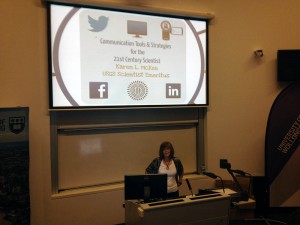
I gave a keynote address “Communication Tools and Strategies for the 21st Century Scientist” at the Australian Mangrove & Salt Marsh Network conference held at the University of Wollongong in Wollongong, Australia. This was a great opportunity not only to reconnect with colleagues who study my favorite ecosystems, but to share my ideas about communication. You can see a version of this talk on the Prezi website (a few things were changed to fit this particular audience). I got lots of great feedback from the audience, especially students who had a number of questions about developing their own communication strategies. Also, I made contact with other scientists active in science communication:
Fascinating presentation by Karen McKee (@scivideographer) on use of social media and online resources for #scicomm#ASMN
In addition to the keynote address, I also visited Ben McNeil at the University of New South Wales in Sydney and gave a seminar entitled, “How Video Can Enhance the Communication of Science”. Ben is a co-founder of Thinkable, an online platform that facilitates crowdfunding of research and requires proposers to pitch their projects in a 3-minute video. We had interacted previously by email and Skype; so this trip was a chance to meet in person and share ideas about scientists using video. I also made some great contacts with science communicators at the seminar. Read more about Thinkable in this earlier post.
Also, Thinkable is currently running a competition with a $5,000 award; the submission deadline has passed, but voting is ongoing until April 30, 2015. I mention this competition because you can see how some researchers are structuring video proposals and perhaps get some ideas for your next video (and don’t forget to vote!).
Videography
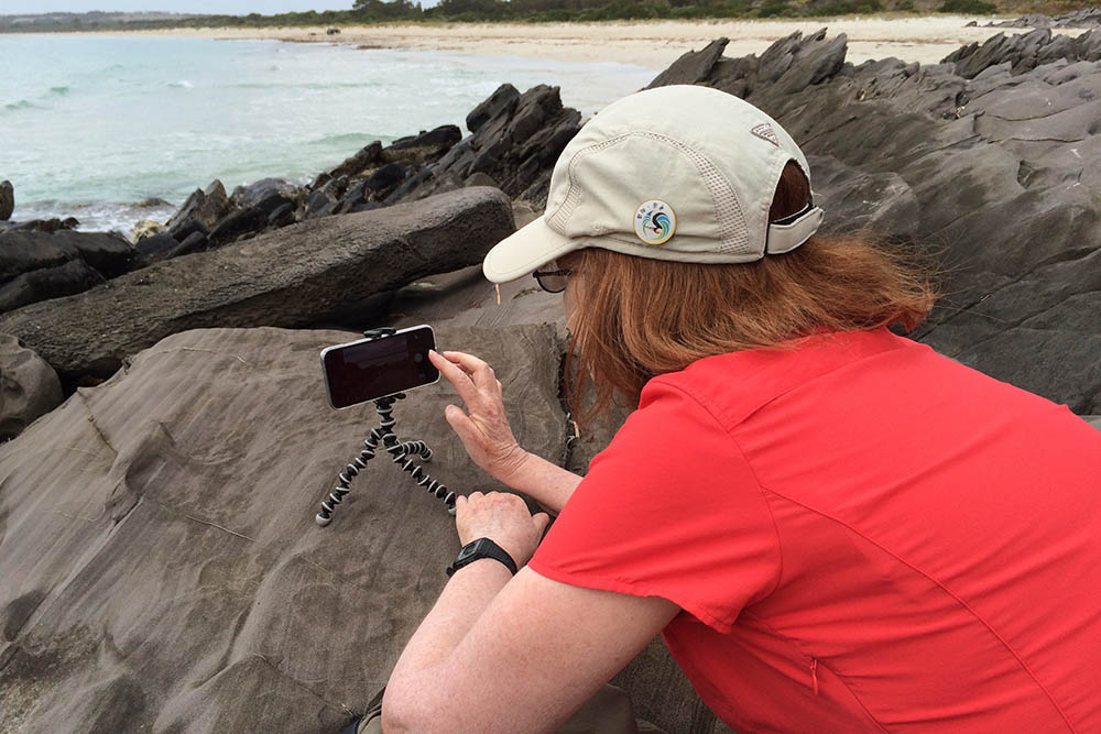
I also had the opportunity before the conference to do some traveling around South Australia and try out my iPhone 6 to shoot video. In the photo, I’m setting up the phone to shoot a time lapse of the surf on Kangaroo Island. I’ll be sharing my experiences and some of those videos in later posts.
Mishaps
As you may have noticed, I’ve not written any posts recently. Between traveling and a computer crash (aaaarrgggghhhh), I’ve not been able to write much of substance. I was really hamstrung without access to my photo and movie files. Fortunately, I had everything backed up….unfortunately, the backup was at home 9,000 miles away. However, I’m now all set up with a new laptop and ready to catch up with my writing.
 Salt Marsh Network conference